AP Pieces '23-'24

Hi! I'm Sierra
This is my AP 2D Art Portfolio from 2023-2024
Use the arrows to move around!
<-- Home Page / Sustained Invest -->
My sustained investigation is of a magazine from the 1920s to comment on the social and political ideals of the time. I'm taking a deeper look into concepts that aren't talked about very much and using my existing knowledge of historical fashion to create pieces that are relevant both then and today.
<-- About Me / Quality -->
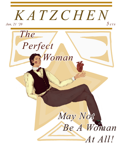

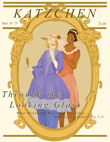
This first piece is a more lighthearted take on the idea of “masculine women” and the subversion of gender roles in the 1920s. Many lesbian subcultures were growing in bigger cities at this time alongside the women’s suffrage movement and with that came the idea of a more boy-ish “new” woman, though masculine women were still very taboo.
The major artistic decision I took was to render this drawing in a much different way than I ever have before. It was an experiment and I think it came with both positive and negative aspects of the drawing.
8.5x11 Photoshop
-----------------------------------------------
This piece is a comparison between one feminist movement from the 1850s to the suffragette movement of the 1920s. The “Bloomer Girls” were women who wanted to limit the amount of layers a dress required to hold up its shape. Its popularization caused a lot of media attention due to the fact that women were wearing pants for comfort. The invention of the cage crinoline in 1856 caused the movement to lose a lot of steam due to the crinoline keeping the skirts off of the skin directly and not causing discomfort. Women still wore bloomers up into the later decades of the 19th century, but they were shorter, made of cotton, and used as underwear.
8.5x11 Photoshop
-----------------------------------------------
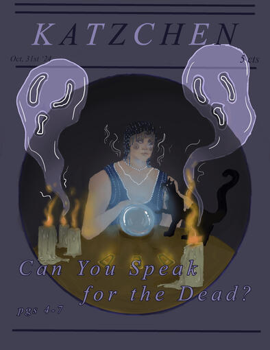
This piece is about the Spiritualist religious movement that came about around mid-century 1800s and boomed again in popularity in the 20s as a response to the first World War and its’ death toll. Lots of the elements of this piece are just things we identify as “spooky” in our culture, like the black cat with gold eyes, candles, a crystal ball, tarot cards, etc. If I had more time when I first made this I would have added more stuff around her table to make it more interesting and busy, like bones, jewelry, or feathers and writing tools.
8.5x11 Photoshop
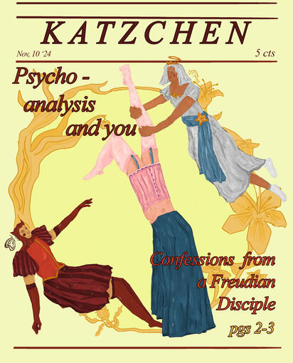
This piece is about the Freudian psychosexual concept of Id, Ego, and Superego. The Id represents the most basic instinctual desires and is the first thing present in someone after birth, the Ego is the needs of instinct applying to the demands of society, and the Superego is morality and parental authority that keeps the person in check. Some artistic decisions I made were the outfit designs and the border which has multiple different plants on them that have corresponding floriography meanings. The plants on the left are an apple tree and a thorn apple which represent temptation and deceitful charm. The plants on the right are the white lily and the star of bethlehem which represent modesty and purity
8.5x11 Photoshop
-----------------------------------------------
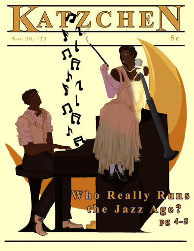
This piece is referencing the “Jazz Age” of the 1920s that, despite all of the depictions of the time period in media having primarily white people, was created and basically ran by black artists in neighborhoods like Harlem and Greenwich Village, New York. Not a lot of people think about the groundbreaking black jazz artists when they think of this time period, their mind normally goes to something like The Great Gatsby, so I thought making a piece about it would be interesting.
8.5x11 Photoshop
-----------------------------------------------
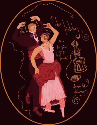
This sustained investigation is about a fictional perfume ad emulating the ones from the 1920s. It markets itself as a gift meant for your lover and is lavender scented. The main figures are meant to symbolize those lovers, I was going to make a 2nd one as a later piece that features a gay couple in this same format just with a different scent of perfume. Lavender has been a symbol for lesbianism for awhile so I chose to use it both as the scent and in the outfits of the figures. Some artistic decisions I made were mixing the outfits with elements from 1980s fashion and not just keeping it completely accurate because I like the poofy look. I also chose to use a pink overlay to make it seem more love related.
8.5x11 Photoshop

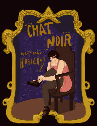
This sustained investigation was another ad that I found prevelant in different older magazines. I thought it’d be interesting to portray a hosiery ad since we don’t really see that anymore, and tights aren’t really a sought after item of clothing anymore. But they were integral to an outfit for decades throughout the 19th and 20th centuries.
Some artistic decisions I chose were to do a more complicated/fun background with the chair, the changing curtain, and the custom border, which made the relatively plain piece more interesting.
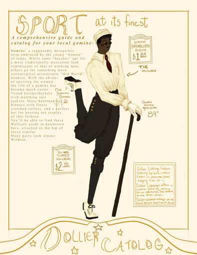
8.5x11 Photoshop----------------------------------------------My 8th sustained investigation was another ad. This piece is an ad for a fake mail-order fashion catalog, and the piece itself acts as both an ad for the catalog and an entry in the magazine itself. It covers the idea of a “gamine” which was originally a derogatory term for women who dressed similar to men. The term was both misogynistic, as it directly targeted women, but also somewhat homophobic, as gamine fashion was based off more effeminate male fashion that did not fit into the change in mens fashion that happened during the 1900s. In the 1920s, and especially after the Great Depression and WW2, men’s fashion became more stereotypically masculine, with boxy silhouettes that still hold up today. In the little writing blurb I wrote about the unity between a person who dresses in this more stereotypically masculine fashion and someone in a more effeminate type of dress. Since toxic-masculinity is a huge aspect of some peoples personality, even if they were born as a women.
8.5x11 Photoshop
<-- Sustained Invest. / Semester 2 -->
For the next semester I chose to change the medium I used to make my art! I switched from a digital medium to a physical one. Throughout these pieces, I used multiple different mediums, like watercolor, fabric, cut/paste, colored pencils, and Copic markers.
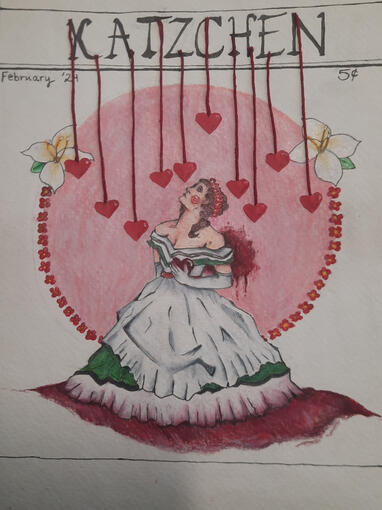
This sustained investigation is based on the idea of loss and grief in times when you’re supposed to be celebrating love. I chose to do it now since it's February and almost Valentines and so much horrible, horrible stuff is going on in the world that it's hard to celebrate any form of love, at least for me. I feel like this sentiment was shared during the early 1920s as well, as WW1 had just gotten over with and so many people were faced with horrors they had not yet been exposed to. And the amount of people who lost their lives during this time, not just to the war but to other horrible practices like the labor industry, definitely made it hard for some to understand and process the idea of love. The colors on the dress are reminiscent of the Palestinian flag as thats something I’ve seen a lot about that affects me incredibly deeply and I thought would make sense to allude to here.
7.5x9.6 Pen, Colored Pencil & Thread
--------------------------------------------------
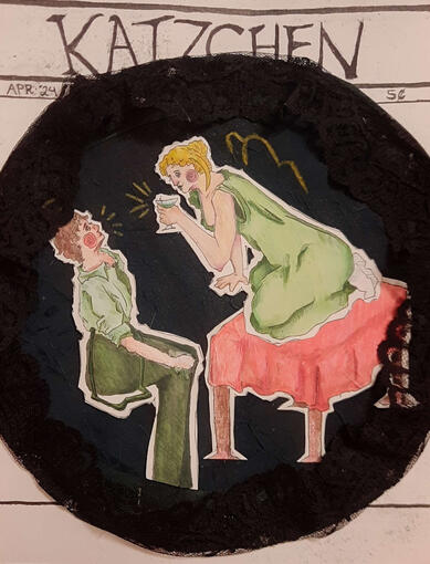
This sustained investigation is about disease and pandemics, which is something that we face routinely throughout the centuries. This is referencing epidemics like influenza and how heavily it impacted people before the invention on penicillin as well as Covid-19 and how it impacts us now in our modern times. I originally wanted to use parchment paper on the main figures to make them look more ghostly, but that didn’t work out as I wanted it to. So I used fabric to make the main figures stand out from the background.
7.5x9.6 Pen, Colored Pencil & Fabric
--------------------------------------------------
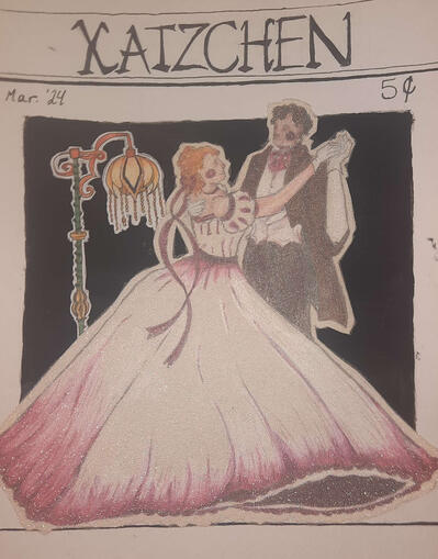
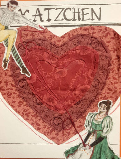
This sustained investigation is based off the idea of a forbidden romance ie Romeo and Juliet. It’s kind of a basic idea, but I liked the idea since it gave me the vibes of both a theatrical production of the time, and the fact that both now and today people are separated from their lovers for various reasons. I decided to use fabric again in this sustained investigation because I had a really fun time embroidering it and designing that part. This one definitely isn't my best and I could've done a lot more to expand on the concept.
7.5x9.6 Pen, Colored Pencil, Fabric, & Thread
This sustained investigation is based on the idea of this “green fairy” that was popular in absinthe ads of the time. Absinthe was/is an incredibly addictive and strong type of alcohol and was infamous during the late 1800s and early 1900s. This obviously represents the current state of things and how common addictions are, even if it's not alcohol. I think it's really interesting that throughout every time period there's a tendency to normalize and sensationalize a type of addiction, a major one being alcohol (especially because of the reaction to the temperance movements throughout the West). Now it’s definitely the concept of vaping, more specifically dab pens, and despite the huge reaction against it there's still a desire for younger people. Normally that desire grows due to the negative reaction.
8.5x11 Pen, Copic Marker, Colored Pencil, & Fabric
-----------------------------------------------
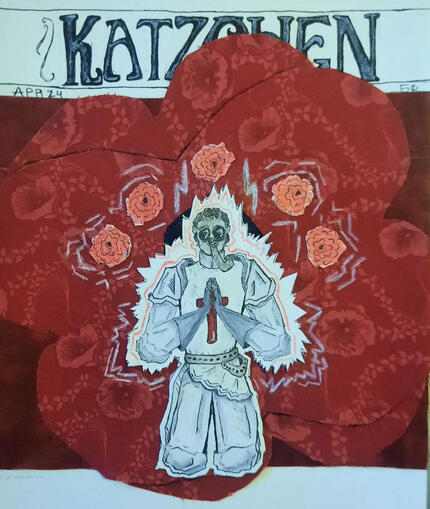
This sustained investigation was based off the idea of war and its influences in the early 1900s throughout the entire world. The interwar years were rife with political and social change in most if not all western countries, and some of these political changes ended up having lasting consequences (as in a second world war). I originally thought about designing something along the lines of one of the four horsemen of the apocalypse, but I ended up choosing to design a Saint instead. I put them in a gas mask to tie it back to the time where the piece takes place, with chemical weapons being introduced in the 1st World War and causing incomprehensible horrors.
7.5x9 Pen, Colored Pencil & Fabric
--------------------------------------------------
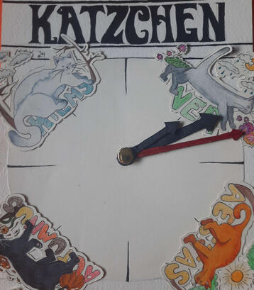
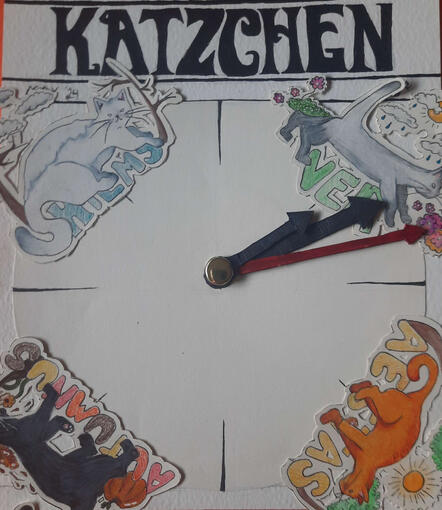
My final sustained investigation is about the passage of time and how quickly it goes by. This whole year has gone by so fast for me and I haven’t totally caught up yet, but I’ve really enjoyed everything I’ve made this semester. An artistic decision I chose was to make the clock part functional as well as draw cats. I chose to do cats because I had always wanted to do something with cats since I had planned out all my projects within the first few months.
7.5x9 Pen & Colored Pencil
<-- Semester 1 / Quality -->